
BOM DIAS
BRAND IDENTITY


Bom Dias is a fictitious cafe ‘located’ in the heart of Toronto. Bom Dias mission is to modernize the portuguese cafe while maintaining the portuguese traditions within the brand narrative. This 5 star cafe is meant to attract workers in the financial district on their way to work and doubles as the ideal meeting place for groups of 2-3. The aromas of Portuguese coffee roasting, the daily baked goods and the fresh hydrangea’s delivered daily from the local flower shop fill the space with aromas that transport any guest to the mainland.

INSPIRATION
Portugal has some of the worlds best baked goods, coffee and soups. The culture and food are equally as vibrant as the land it was built on; endless rolling hills of lush greenery and colourfully painted towns. Toronto has many Portuguese bakeries but none of them capture the true essence of the mainland in their brand identity. The vast majority of them attempt to fit into the city, damping the portuguese culture in their branding in order to appeal to a broader market. Bom Dias was created to provide a 360 experience designed to transport guests to the mainland through color, music, taste and texture. The aim of the brand is to convey the traditional image of Portugal in a modern light through the use of identifiable assets that carry a strong visual history. The following presentation of the brand was created to demonstrate the print applications of the visual identity.
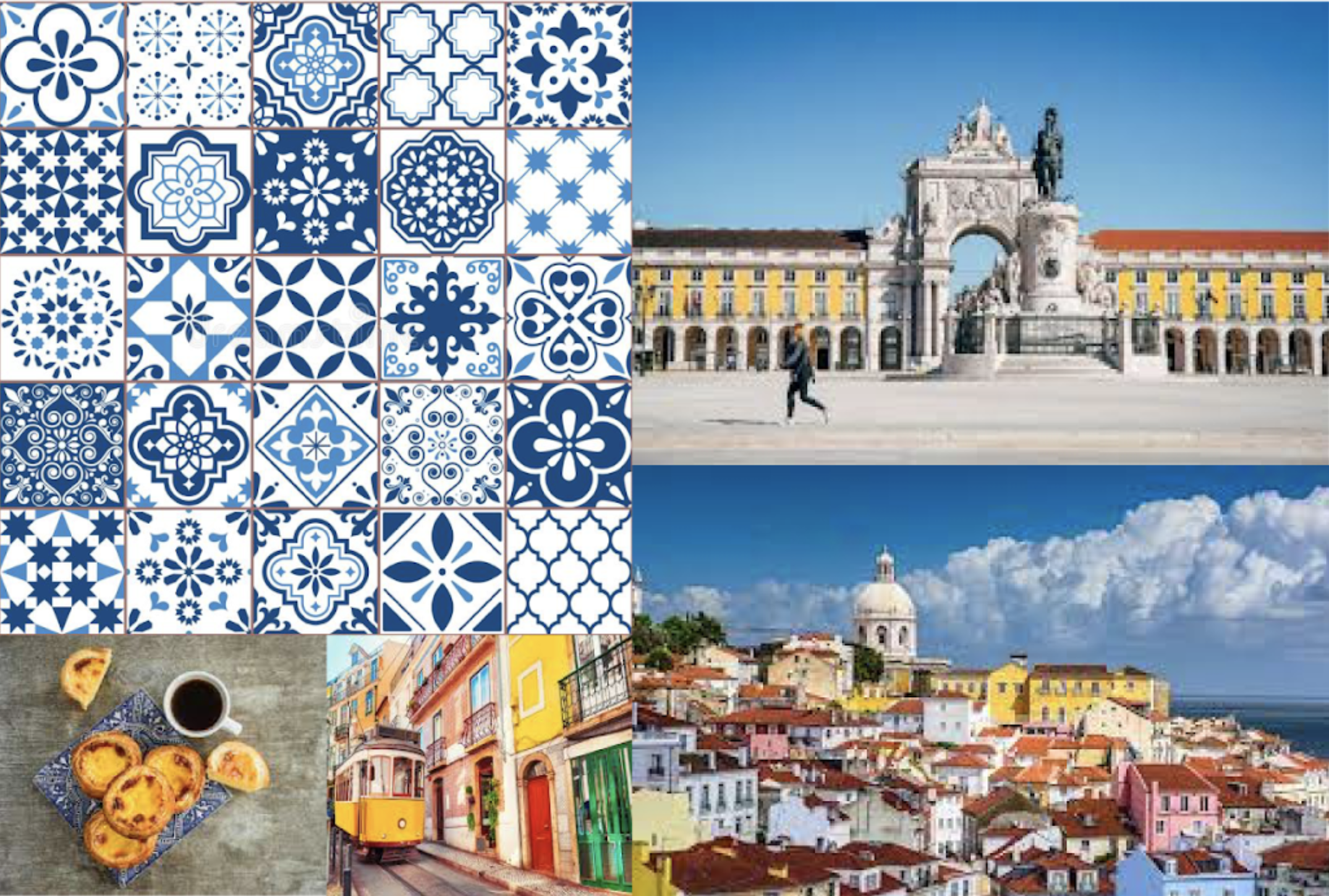
MOODBOARD
The idea for this moodboard is not to show a finished product or images of other brands i could pick and choose assets from. The idea of this mood board was to convey the feeling of Mainland Portugal so that the brand could grow to emulate the overall feeling of life in Portugal.
BRAND IDEATION PROCESS
BRAND PERSONALITY
The first step i took was the ideation of the brand personality using keywords. I started with the brand personality first because i needed a straightforward example of what the overall brand was trying to communicate. This came in handy when creating the visual identity because i had a simple breakdown of the brand to refer back to whenever i strayed off the path.
TRADITIONAL
PREMIUM
ADULT
HOMEMADE
SOCIAL
TRUSTWORTHY
MINDMAP

TYPEFACE RESEARCH
ADOBE FONTS
I went with Mendl Sans which is a Sans Serif typeface. I chose this typeface because it is very similar to the 19th century stone signage that can be found plastered on many buildings in the Azores. This typeface also provides the luxury, high end eatery vibe I was looking for.

TYPEFACE RESEARCH P.2
MAIN LOGOTYPE


TYPEFACE RESEARCH P.3
SECONDARY TYPE IN LOGOTYPE


SYMBOL RESEARCH
LOGO SYMBOL
SUN + PORTUGUESE TILE + LUXURY = DESIRED LOGO SYMBOL

FINAL LOGO

LOGO VARIATIONS

COLORS

PANTONE 661 C / 2935 U
RGB 0 53 148
HEX/HTML #003594
CMYK 100 81 0 13

PANTONE 142 C / 121 U
RGB 255 204 82
HEX/HTML #FFCC52
CMYK 0 11 92 0

#FFFFFF

#000000


